
Groundwork UK commissioned me to redesign and expand a suite of illustrations for their Retrofit Your Home campaign. The objective was clear: create a consistent, easy-to-understand visual system that helps homeowners grasp complex retrofit concepts across print and digital materials.
The Challenge
Retrofit topics can be visually complex and overwhelming for non-technical audiences. The original resources were a mix of styles from various campaigns, resulting in a fragmented visual identity.
Key challenges included:
• Unifying old and new illustrations into a single, recognisable style.
• Creating clear, educational visuals that simplify technical information.
• Ensuring scalability across multiple formats — roller banners, booklets, and themed leaflets.
• Maintaining brand alignment and identity.
To address this, I introduced a visual design system based on isometric perspective, modular structures, and a minimalist brand palette.
Key deliverables included:
Results
Even without final analytics, the impact was immediately clear:
A unified visual identity across all retrofit resources
Increased clarity of technical information for non-technical audiences
A scalable illustration system that the client can re-use in future sustainability campaigns
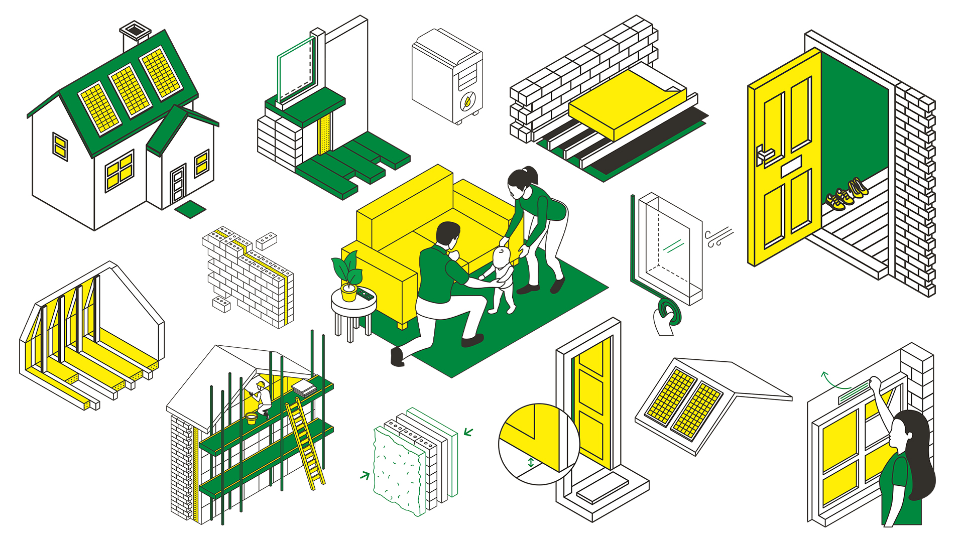
This project reinforced the importance of treating illustration as a system, rather than a set of individual assets. By establishing a modular, isometric base and a simplified brand palette, I was able to maintain clarity and cohesion across more than ten different outputs without compromising speed or accuracy.
It also highlighted that perspective choice is strategic. Using isometric views for technical content and flat views for human scenes helped balance credibility with relatability, making the content more engaging for non-technical audiences.